Copy our practice sheet to follow along as we describe how we built a sheet to graph our utility bills and the relationship between seasonal temperatures and your utility costs. In the practice sheet you will be able to input your own utility costs and set your geographical location to import your specific geographical temperatures.
Relevant Sections
- Practice Sheet Features
- Creating a dynamic dropdown menu
- Creating the graph
- Importing temperature data
- Formatting the temperature data
Goal of Our Spreadsheet
The practice sheet is intended to show the temperature’s affect on your monthly utility bills.
To accomplish our goal of showing the relationship between temperatures and our monthly utility bills we will need two data sources. Utility data and temperature data. Utility data will be provided by the user but we will import the temperature data and create dynamic menus to make it simple to extract temperature data for different cities across the America.
We designed this sheet to be accessible by all users, you just need to enter your utility bills and select an appropriate city to display relevant temperatures. The practice sheet is easy to use. Aside, from the spreadsheet features we also use these posts as a teaching opportunity to expand your Google Sheets knowledge, to help simplify the power of spreadsheets.
Practice Sheet Features
Features
- Dynamic dropdown menu to select your state and city and return the average temperature. Average temperatures are imported from this wikipedia page; so not all cities or states are available.
- A graph that will chart your location’s average monthly temperatures and display your utilities in comparison.
Dynamic City Select Menu
Filter Method
Creating dynamic menus is a great way to expand your spreadsheets’ accessibility. With a dynamic dropdown menu it’s intuitive to the user what values are available for them to select. This is a great skill to have personally and professionally, as it makes it easier for family members or coworkers to utilize your Google Sheets spreadsheets.
To accomplish our dynamic menu to allow for a user to only see cities within their selected state we use the Filter Method to create our dynamic menu.
=FILTER(B:B,A:A='Temperature Parameters'!A3)You will find this formula, utilizing the FILTER function, in the “Data Validation Variables” tab in cell D2. This formula will produce a list of all cities in column B that meet our set conditions of the FILTER function. We only need one condition and that is to filter cities if column A, that contain the corresponding state, equal the selected state in our “Temperature Parameters” tab, which is held within cell A3.
Data Validation Criteria: List from a range
With a column producing a filtered list, that is dictated by a cell that contains our FILTER function’s conditional variable, we are ready to create our dynamic city dropdown list. We will create a data validation in cell A4 in our “Temperature Parameters” tab to display the dynamic city list. We will set the data validation criteria to “List from a range”. The range can be seen below.
'Data Validation Variables'!D2:DThis will ensure that the list of cities we have filtered will be available in our city select dropdown menu. We have now successfully created a dynamic or dependent dropdown menu. The selected city is then used to return the average temperatures. Returning the average temperatures is more advanced, so we will cover that topic further down.
Graphing Utilities & Temperature
The main goal for this spreadsheet is to see the relationship your geographical specific temperature has on your different utilities. A table of numbers is not easily digested, nor can trends be easily spotted. A graph that charts your monthly utilities and compares the average temperature allows for a user to easily see the relationship between temperature and utility cost.
We must first get all relevant data into a table/range of cells we can reference. We created a simple table in our “Utilities” tab that will provide the data for our chart. The first column (Month) can be copied from the header in the “Temperature Parameters” tab and can be pasted using “Paste transposed” so the months are now in a vertical column. For the second column, we used an HLOOKUP function to find the corresponding month and extract the average temperature for that month; see the formula below. Finally, we manually enter our utility bills for the past year.
=HLOOKUP(A3,'Temperature Parameters'!$E$2:$P$3,2,FALSE)You’ll notice some additional functions in the temperature cells, but they are for formatting purposes.
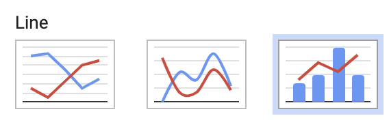
With all of the appropriate data in a simple to understand table we are ready to create our chart. First, we select our Month, Temperature, and Utility columns. Then we navigate to Insert Chart in the menu.
To accomplish the chart seen above we will want to create a Combo Chart. This will allow us to display the monthly average temperatures as a separate visual from our bills.
Easily change you chart colors by selecting the different variables. We did this to align color association with the utility, for example, yellow as our electric bill.
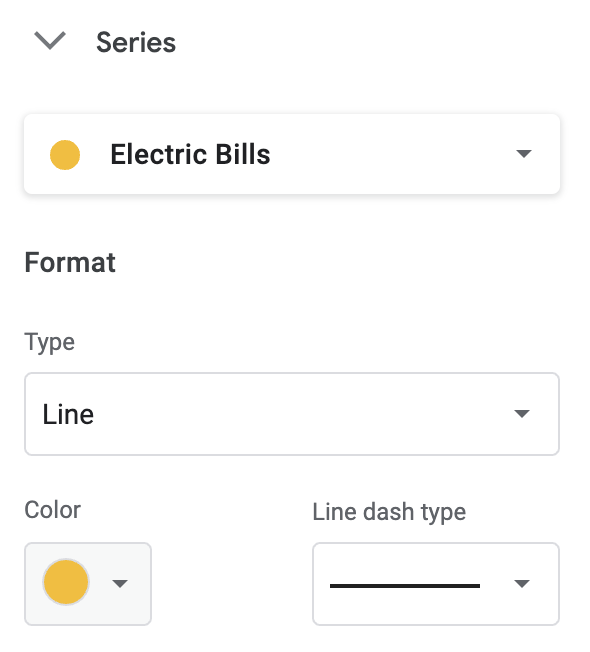
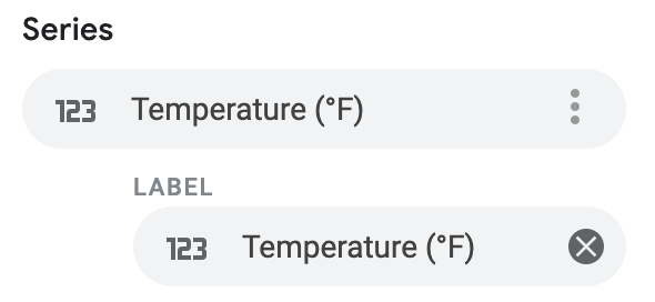
Set up labels to display data point values directly on your chart. We use labels to show the average temperature directly on the chart.
At this point we have an easy to understand chart and a dynamic menu to pull temperature data that is relevant to our specific geographical location. When we change our state, our city dropdown will update. When we change our city the temperature data will update in our chart.
Importing Temperature Data
For this specific spreadsheet we imported data directly from wikipedia using the formula below.
=IMPORTHTML("https://en.wikipedia.org/wiki/List_of_cities_by_average_temperature","table",4)Formula Explained
With the IMPORTHTML function we are able to import data from web pages. We extract data that are contained in either a <table> or <list> HTML tag. For this particular formula we are extracting data from this wikipedia page, from the 4th instance of a table tag on the page.
In our “Temperature Data” tab we import the data, then copy and paste the data as values. This ensures our practice sheet will always work. But, if you wanted to have the latest information you could delete the temperature data and paste the above formula into cell A1 to extract the latest data from our source URL. The IMPORTHTML function enables you to import data sets and keep your variable data up to date. This function can greatly expand your Google Sheets skillset and has a wide variety of applications.
Extracting & Formatting Temperature Data
These are advanced formulas, but we will explain how and why our formulas are used to extract and format the imported temperature data.
You’ll notice that the IMPORTHTML temperature data is not very friendly to reference as both Celsius and Fahrenheit data are in the same cell and on different lines. The Fahrenheit data is also wrapped in parentheses. This data in its current form can’t be referenced, extracted, or graphed. To solve the problem we start by separating Celsius and Fahrenheit data, we will utilize the LEFT and FIND functions.
=LEFT(reference_cell,FIND("(",(reference_cell)-2)Formula Explained
In the above formula we are finding the first instance of a right parentheses “(” within our referenced cell. This will return a numerical position of the parentheses within our referenced cell. To extract only Celsius data from the cell we will need to subtract 2 spaces for the number_of_characters to be extracted. Since the data is imported in a consistent pattern we are able to extract the Celsius data with the above formula.
Reference Cell
Because the cell we wish to extract is dynamic based upon the selected city we will use an Index Match formula.
=INDEX('Temperature Data'!$A:$O,MATCH($B$3,'Temperature Data'!$B:$B,0),MATCH(E$2,'Temperature Data'!$1:$1,0))Formula Explained
This formula will return the cell in our “Temperature Data” tab that matches our selected city and the corresponding month. Simply put we return the numerical row and column that match our city and month respectively. This will return the average temperature for the selected city in the corresponding month.
We will not spend too much time on Index Match as we discuss this topic elsewhere on our site, but if you are unfamiliar with the Index Match formulas, consider exploring the topic as we use it in nearly every practice sheet we create.
Convert Data
At this point we have now extracted the Celsius data into “Average Temperature By Month Table”. We can now utilize the CONVERT function. With the formula below we are able to convert Celsius into Fahrenheit.
=CONVERT(E4,"C","F")Formula Explained
This function converts the data in cell E4 which is the Celsius data we extracted in the previous steps. Learn more about the available variables the CONVERT function can utilize.
Our temperature data is now extracted and usable by our chart. You will notice additional functions, they are to ensure the formatting of the data is correct and acceptable, but the above formulas are the core concepts we use to extract and format our data.
Extracting and formatting data with functions is an advanced skillset, but it further expands your ability to import data and then manipulate it to meet your needs. If you enjoyed this post consider subscribing to our newsletter to receive tips and practice sheets directly in your inbox.